First of all, I’d like to apologise that this has taken so long. I haven’t been playing SP that much lately, and ngl, I was a bit lazy. Sorry everyone!
Anyways, here we go!
Link to challenge!

Tank Walker by ST_Starlight
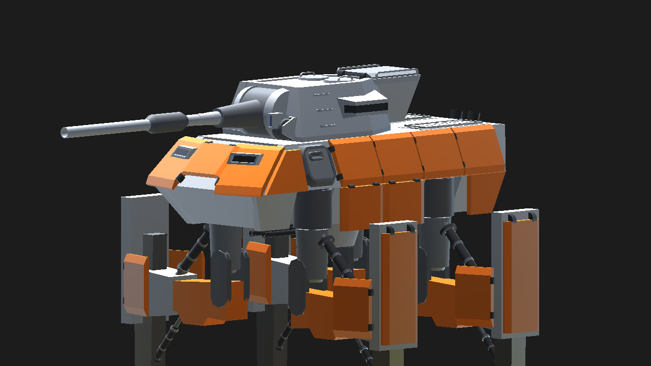
Paint scheme: 18/20
It’s pretty strange that a tank would be painted with bright orange (maybe it is a dessert tank?) but other than that I Think it looks really good. All parts are painted appropriately in my opinion.
Looks: 14/15
I think it looks seriously awesome. I’d say the legs look too long and when you walk there’s a thing that pops out of the leg shield things, but really those are my only issues. The way you’ve detailed this is pretty impressive and interesting. Using air brakes as armour looks super cool and also doesn’t take up too many parts. You’ve also used a few rotators as gents and stuff and I think that looks really nice.
I’m giving this 14/15 because I think there’s still room for detail, like an interior and stuff. But yeah. Very little to fault.
Functionality: 13/15
Walking looks very awkward, like, when you’re at 100% throttle, it’s only touching the ground at the end of its stride. Ngl doesn’t look great. I think more tuning on the displacement of rotators and stuff could have helped here. However, that is my only complaint. Functionality everywhere else is fantastic. I mean, this thing even has suspension! Everything in this works pretty well.
Overall: 45/50

Lockheed F-104G Starfighter Fuerza Aérea de España by asteroidbook345
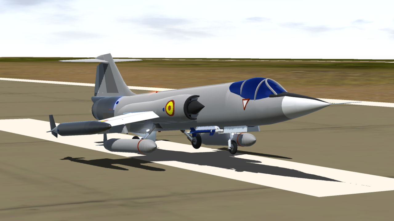
Paint Scheme: 18/20
It matches the real life paint scheme… yeah. I guess there’s not really anything else to say about it.
It's pretty cool that you can make an accurate, real life livery with only using the default paint scheme!
One thing though, it is a bit of a shame that you weren’t brave enough to upload it with only a default paint scheme aircraft :p
Looks: 11/15
Looks pretty good. It’s accurate, it’s relatively smooth. I like the cockpit. The afterburner and the use of the magnet in the engine is pretty cool. There’s some rough patches here and there, no custom cockpit or anything. There could be more detail though, such as words and registrations and warning signs though. Livery detail is low. You did get that curved roundel though. The missiles are blue which is a bit weird.
It’s just lacking detail.
Functionality: 13/15
Probably one of the best flying jets on the site. Realistic performance. Also gear doors are very cool with their functionality.
I guess my only complaint is when you put the flaps down, the clip with the drop tanks. I don’t think that’s realistic…
Overall: 42/50

Vetera Cannon by CreeperOfTyeFortress
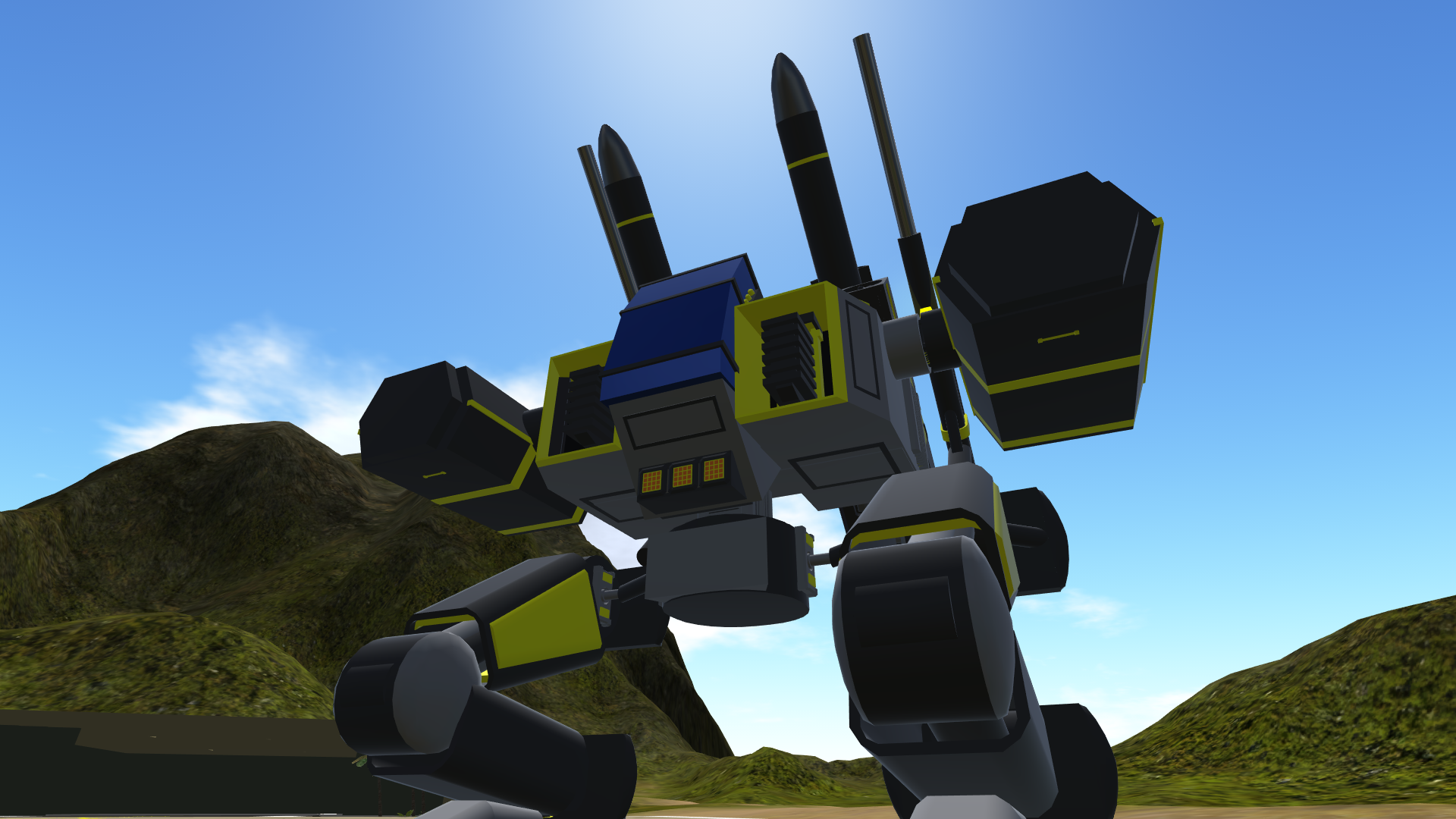
Paint Scheme: 18/20
Paint scheme looks very good and cool! It’s surprising it’s in default colours. I really like it! Tbh there could be a bit more detail though.
Looks: 13/15
Looks fantastic! Again, a bit more detail could have helped though.
Functionality: 4/15
This is the slowest walker I have ever used. :/
My 90 year old grandad could walk to the end of the runway and back and this thing wouldn’t be even a quarter of the way. It’s maximum speed is like 1mph. In fact, I don’t even think it can do that. Boring!
Though, I guess all the weapons and stuff work. It does hit its legs when it’s walking and you turn the body though.
Overall: 35/50

Monitor Style Ship by Quazal16
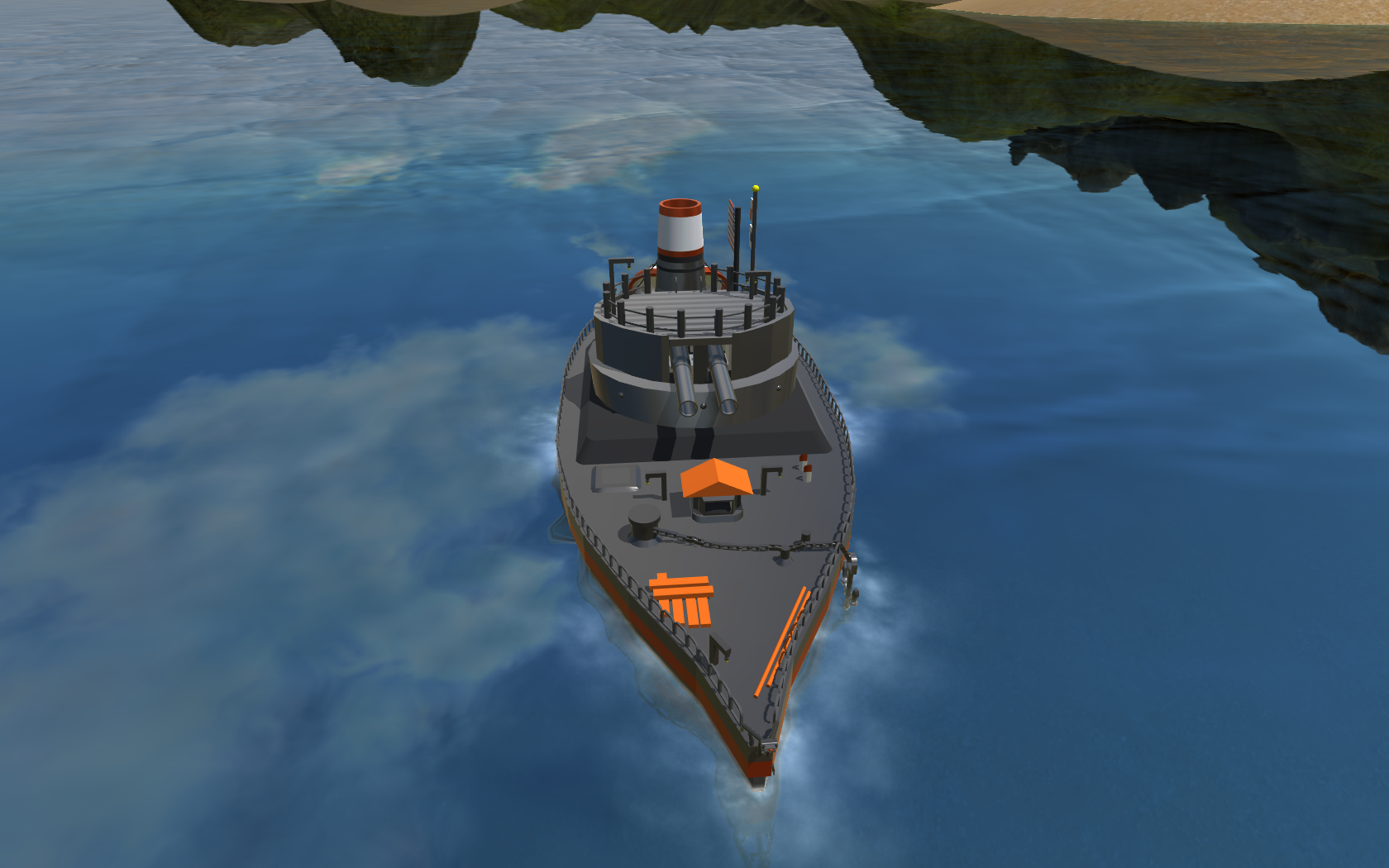
Paint Scheme: 19/20
Paint scheme is fantastic! Painted just how I’d paint it if it were custom colours. I can’t really fault it…
There is a bit of room for improvement though
Looks: 8/15
It’s having a split personality over it’s scale. Is it big or small, I mean, if a human is supposed to fit inside that wheelhouse, how is a human going to get up that enormous ladder? If the lifeboat is human-sized, then I don’t even know how the wheel house will fit a rabbit in it. And those lamps are tiny.
I like the look of the turret. I don’t think it’s that accurate to real ships of this type though, after having a look. It’s very wide and not that high.
Also detail could be higher. And the hull is a weird shape from the side.
Functionality: 8/15
Turret moves well and fires and stuff, lights work, but the boat doesn’t really turn. The rudder yaws and the boat does basically nothing. I mean, that’s a pretty big downside ngl. That’s what boats do…
Also there’s not much special about the boat. It would have been nice to see a deploying anchor and life raft and stuff.
Total: 35/50
Congratulations you peeps! You shall be receiving your prises shortly.

HT-95 Levkov by Stratus

Paint Scheme: 8/20
It’s tyre black, which tbh is pretty boring and ugly and could have been made in every other paint scheme. Could have been far more creative with colours there. It doesn’t need to be black. I managed to make a grey and red paint scheme out of the default and it looks far better.
I just don’t like it. I’m sorry.
Looks: 13/15
I think it looks pretty awesome. It’s like it’s come straight out of blade runner! Super duper cool. In some places there could be a little more small details and the front end could look a little less like a weird face (lol) but yeah I think it’s awesome.
Functionality: 13/15
This is super fun to drive! I love it! My only issues with it are that the yaw power is too strong, and the engines don’t respond fast enough. Weird stuff sometimes happens Weapons work well, but the turret could have a pivot. Kinda awkward that you need to turn the entire vehicle to aim at stuff. Not that useful when the target is behind you…
Overall: 34/50
This was good, however it failed at the main thing that this challenge was about. Maybe if it were entered into a different challenge, it could have done better. :)
I really enjoyed this build, ngl.
DarthAbhinav’ Hound Aviation HT-03 ‘Funky Flier’
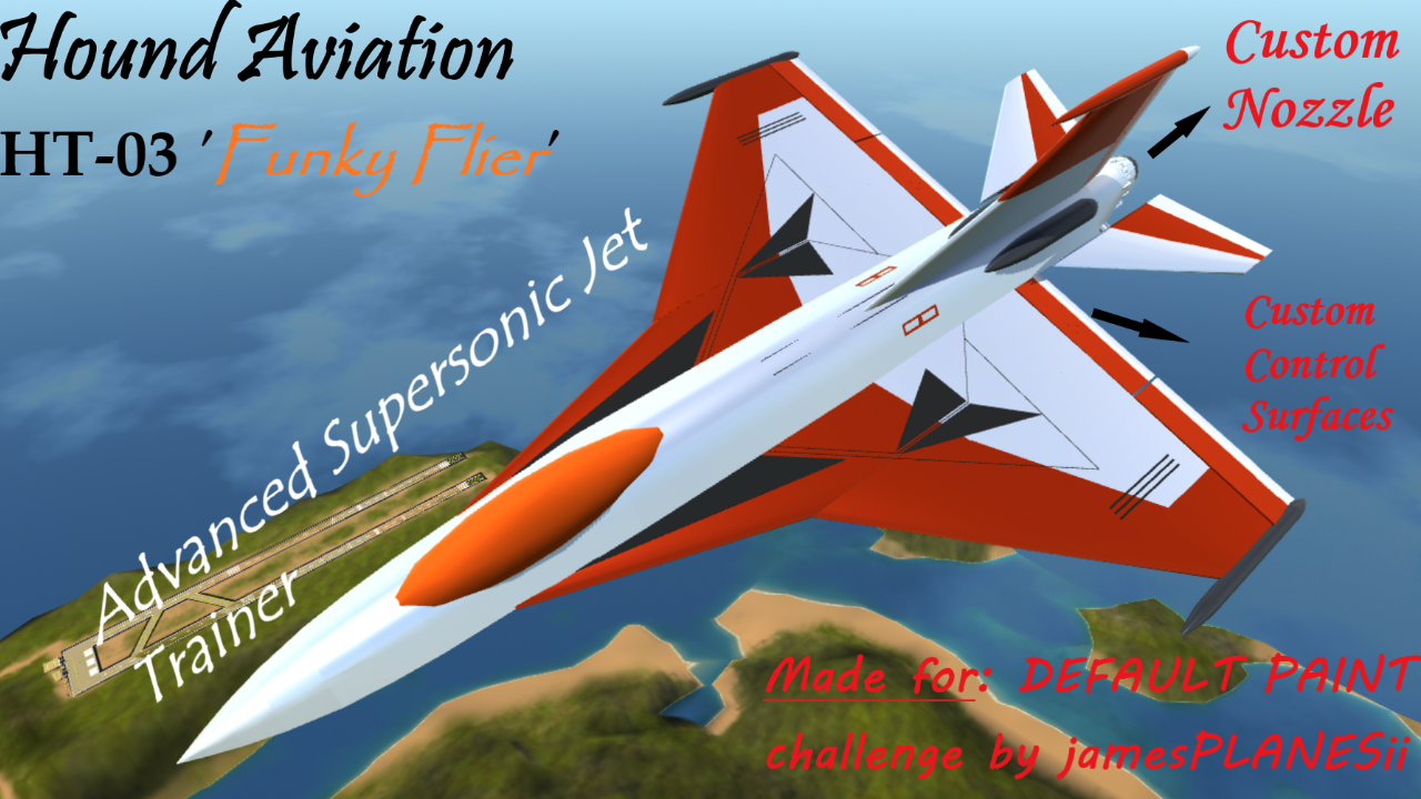
Paint scheme: 19/20
You can hardly tell that it is in default colours! The only things I would criticise are the cockpit looks a bit out of place being matte (but really I think it was the best colour choice with the limiting default scheme so I can’t take that away) and also on mobile, the parts are nudged too close together so it looks all fuzzy with parts clipping.
Looks: 9/15
Wheels don’t retract into wings, rotators that move the custom nozzle are exposed, not scaled down, and in my opinion, ugly. Elevators are square at the back, all control surfaces rotate on their axis rather than moving at their base like real control surfaces landing gear is too large. Overall detail though is pretty good!
Functionality: 5/15
It’s to manoeuvrable, it has autoroll to the left, it doesn’t fly level, rudder and flaps have barely any effect, main gear is placed way too far back and it takes off at 2.5 times the stall speed, accelerates way way too fast. Yeah not great. At least everything works I guess...
Overall: 34/50
This build had used the paint scheme brilliantly, but it really lacked in the looks and functionality department.
Embraer ERJ 200 by ThePropellerIsAFan
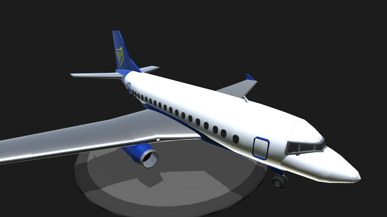
Paint Scheme: 17/20
I think the paint scheme is really cool! You’ve managed to make a real life airline livery seamlessly using the default paint scheme! However, it lacks detail other than the Ryan Air logo on the tail. It doesn’t have wording or any lines and stuff.
Looks: 7/15
It looks relatively reasonable, but it looks more like an old 1960s bowing than an Embraer. Build quality also isn’t great. Basic wings, not custom control surfaces, a weird bottom thing, quite disproportionate.
Functionality: 8/15
Manageability is very plausible for an airliner, however, this has the quite severe issue where when you pitch up too far, you can completely lose your elevator authority and you can flip on your back and die. Not good. Landing gear retracts at a reasonable rate.
Overall: 32/50
This build wasn’t fantastic but it was made by a lower point silver player who I think has quite a bit of potential!



I completely forgot this challenge existed because of how long this took to judge lmfao
Oh lord, I completely forgot this challenge existed. I might've made a better plane, but oh well. Hearty congratulations to all the winners.
MS Paint never gets old
Well done to all the entries for completing their bloody builds unlike me
Eh, this challenge was the start of my improvement.
Good job everyone.
@jamesPLANESii i will say about the moniter type ship it is fairly accurate the wheel house was actually fairly small in them this was to save weight mainly and plus every moniter has a unique shape because back then ships were built funded and designed by the state not the country and that turret is fairly accurate to USS Moniters but instead it looks like it has bigger 32 pounders
Np! @ST_Starlight
thanks,this is the first time I've won a challenge :)
GG everyone. By the way, my HT-95 Levkov wasn’t originally designed for this challenge. It was supposed to be standalone. Issues with my brothers computer delayed the release. I decided to upload it here, maybe get a few extra points if I won. Probably should’ve waited for another kind of challenge.
By the way, it’s actually from a game called Battlefield 4.