Specifications
General Characteristics
- Created On iOS
- Wingspan 52.0ft (15.8m)
- Length 38.0ft (11.6m)
- Height 18.0ft (5.5m)
- Empty Weight 13,700lbs (6,214kg)
- Loaded Weight 16,000lbs (7,257kg)
Performance
- Horse Power/Weight Ratio 0.156
- Wing Loading 35.9lbs/ft2 (175.1kg/m2)
- Wing Area 446.0ft2 (41.4m2)
- Drag Points 5940
Parts
- Number of Parts 100
- Control Surfaces 6
- Performance Cost 598

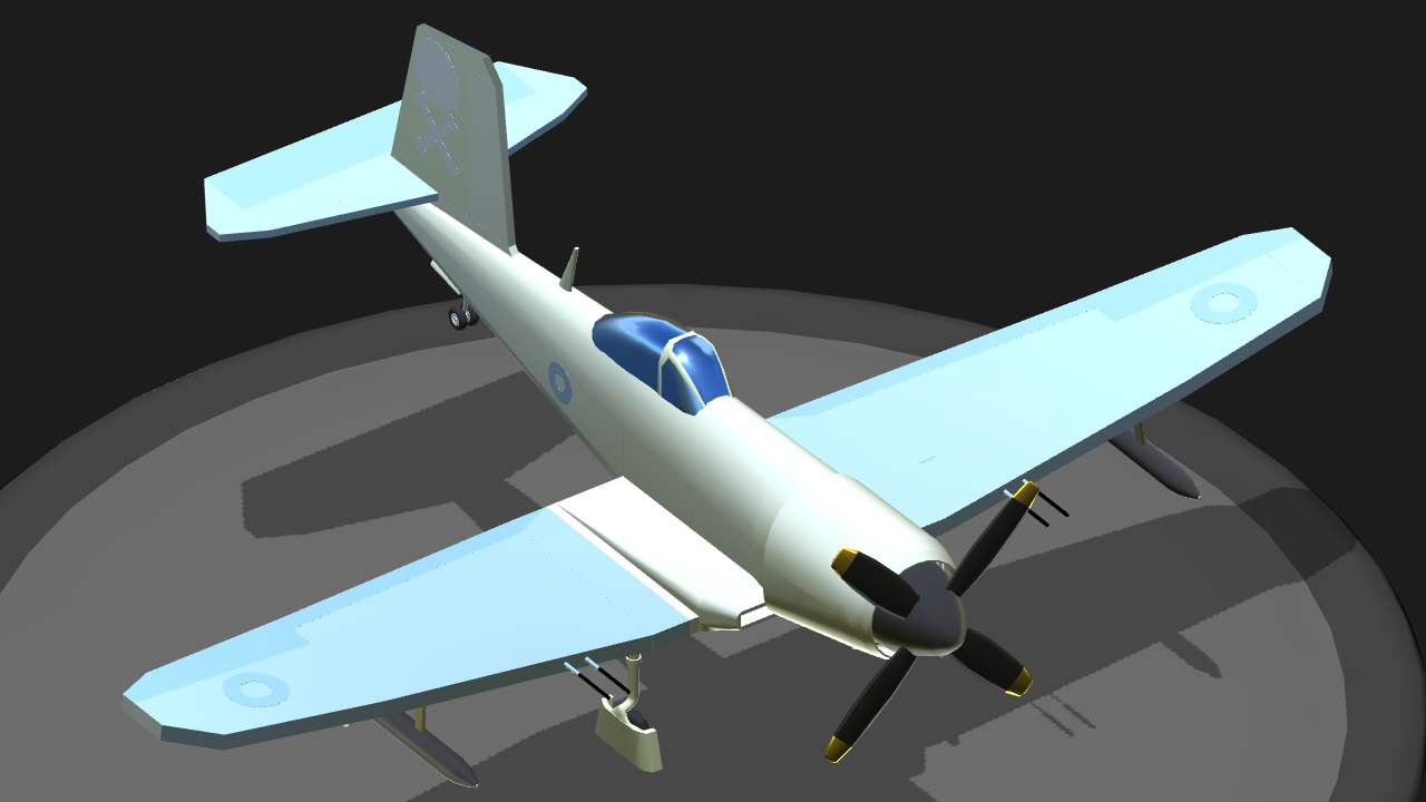
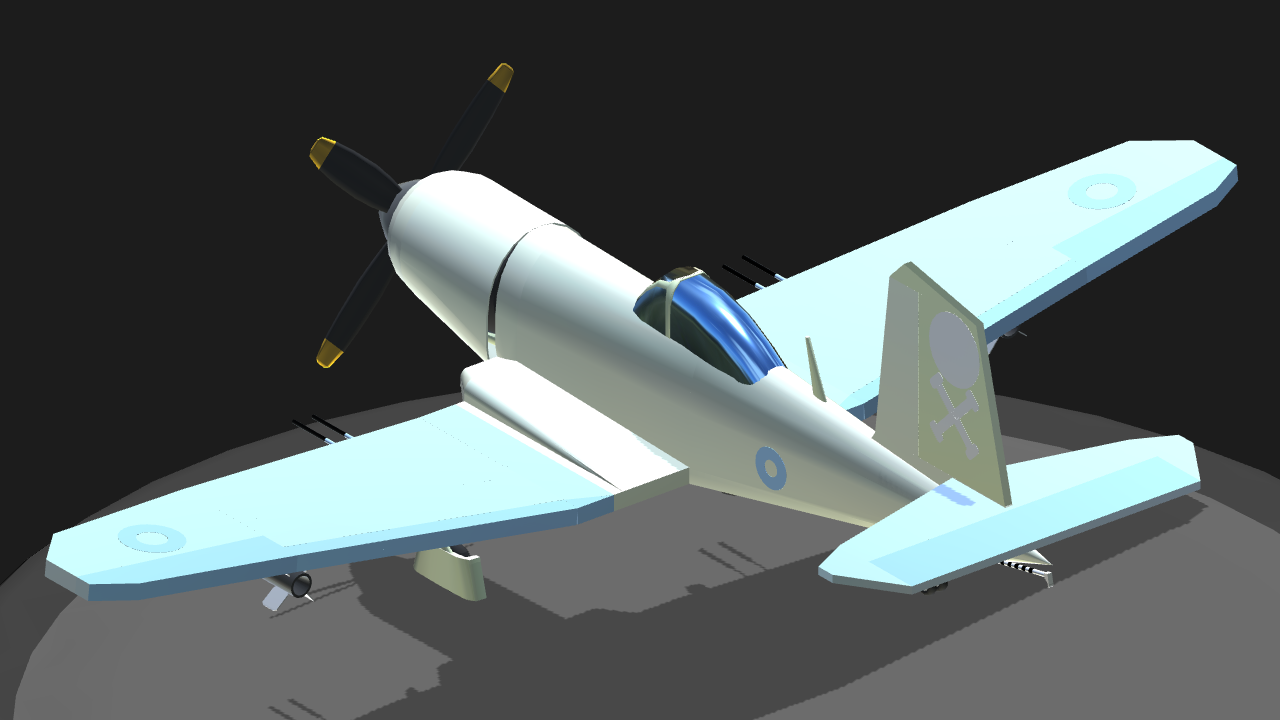
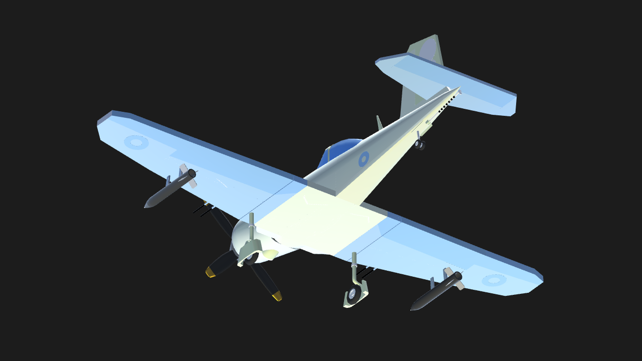
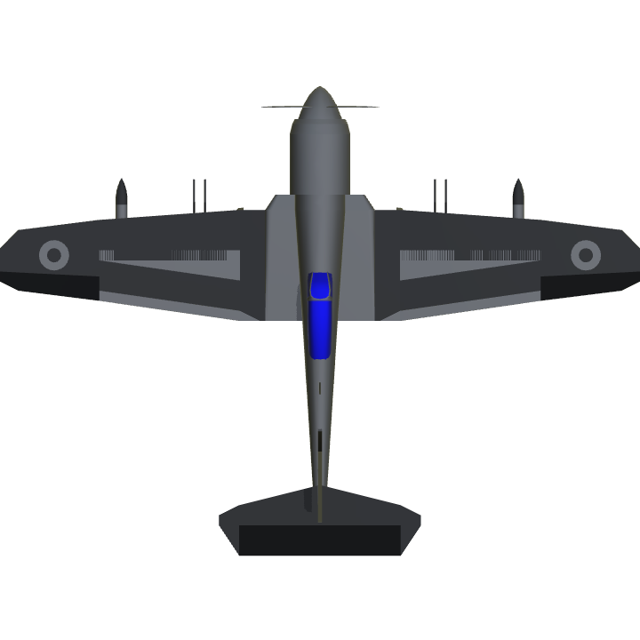
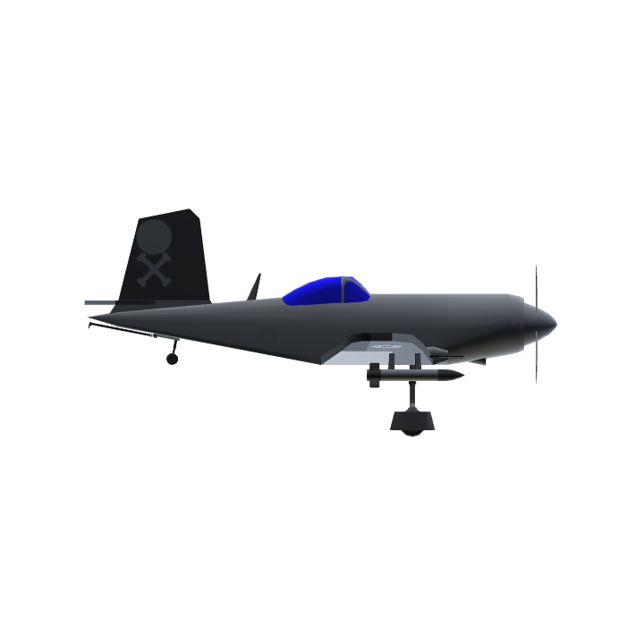
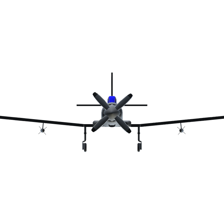
That’s not the point. The way people perceive it is like how I told you. As I said, ortho view messes up perspective. It turns your model into a 2D projection. The picture literally has 0 depth, and it looks really bad. The reason you don’t see it is because you’ve been looking at the picture in normal view and you’ve changed it to ortho view and it looks different and therefore defaultly cooler. Bit everyone else has just seen the ortho view and it messes with their brains. I personally think ortho view looks awful in screenshots, which I’m not the only one thinking that since even though this plane has a relatively decent paint scheme and a good shape, it has just 2 upvotes.
Don’t use ortho view. @Kingflyer1
Ah, you see that’s where you’re wrong. It’s precisely because of lack of perspective that they’re actually the exact same size. Take a screenshot and measure, if you will. If I were you, I’d get used to it; SimplePlanes is a basic CAD software and most, if not all CAD programmes present objects in isometry.
@jamesPLANESii
Your right wing is teeny weeny and your left wing is stupendous because of the lack of perspective. It’s giving me a headache @Kingflyer1
Rubbish. I love the isometric view because it doesn’t favour certain proportions through perspective. I guess it’s just an engineering thing. Anyway, thanks for the upvote!
@jamesPLANESii
Ugh ortho view. These screenshots are particularly distorted. :/